
The Importance of Color Choice in Design Systems
Feb 2, 2023
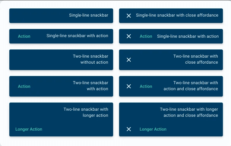
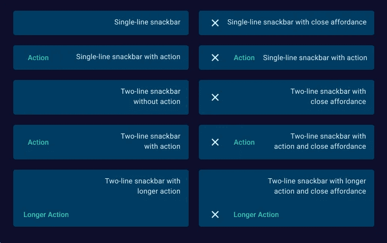
Having a limited color palette for both light and dark modes can simplify the design process and ensure consistency in the user interface. However, it’s important to consider the context in which the color combinations will be used, as well as the intended user experience. If the color choices are not suitable for the content or do not provide adequate visual contrast, it may affect the legibility of text and the overall usability of the design. Additionally, it may not be flexible enough to accommodate future changes in the design or to meet accessibility requirements. In these cases, it may be necessary to expand the color palette to accommodate different needs.
Design systems play a crucial role in the development of digital products. They provide a unified visual language and a set of guidelines for designers and developers to create consistent and accessible user interfaces. One of the most important elements of a design system is the color palette, which can have a significant impact on the work speed of both designers and developers.
When creating a design system, it is important to consider how the choice of colors can affect the speed of work for both designers and developers. A well-designed color palette can streamline the design process, while a poorly chosen one can slow down the work and cause frustration.
One way to optimize the color palette for design systems is to choose a single color combination that can meet all accessibility and contrast conditions for both light and dark modes. This can help ensure that all elements in the design system are accessible to users with disabilities and meet the contrast requirements set by the W3C Web Content Accessibility Guidelines (WCAG).

Ali Biari
Senior Product Designer
In addition to meeting accessibility requirements, a well-designed color palette can also improve the speed of design work by reducing the time spent searching for the right color or adjusting the hue and saturation of a particular color. With a limited color palette, designers can quickly choose the right color for their design, freeing up time for other tasks.
For developers, a well-designed color palette can also help speed up the development process. By having a clear and consistent color system, developers can save time by not having to constantly switch between different color combinations or deal with unexpected color changes in the design. This can help reduce the likelihood of errors and improve the overall efficiency of the development process.
In conclusion, the choice of colors in design systems has a significant impact on the work speed of both designers and developers. By choosing a single color combination that meets all accessibility and contrast conditions, designers and developers can streamline the design and development process, saving time and improving the overall quality of their work.
The choice of color in a design system can have a significant impact on the work speed of developers and designers. A well-thought-out and well-organized color palette can greatly speed up the development and design process, as it provides clear guidelines for how colors should be used, making it easier for developers to create consistent designs and for designers to quickly find the colors they need. On the other hand, if the color palette is poorly organized, or if there are too many colors, it can slow down the development and design process, as developers and designers will have to spend more time trying to find the right colors and making sure they are used consistently. Therefore, it’s important to carefully consider the impact of color choice on work speed when designing a design system.